
Bright Star Books Website Redesign

Project Objective
Allow users to donate money and items to an organization where results can be seen. Additionally, give the donor the ability to positively impact their community.
Solution
Our solution was an overhaul of the website both visually and functionally. We were able to make it easier for the user to find relevant information and accomplish tasks based on the goal of the organization.
Team
3 UX/UI Designers
My Role
UI design
UX research
Team Leader
Timeline
Overall: 3 Weeks
Discovery & Research: 1 week
Design & testing: 2 weeks
Tools
Google Suite
Figma + Figjam
Trello
Process

Research

Ideation

Wireframing

Testing

UI Design

Results & Conclusion
Research
To create solutions that are more closely aligned with user needs and meet the goals of the organization, we began with research. We wanted to understand our users and what types of things they look for when making donations. To do this, we: Took a look at the original site for a heuristic evaluation, conducted a survey, and created user personas.
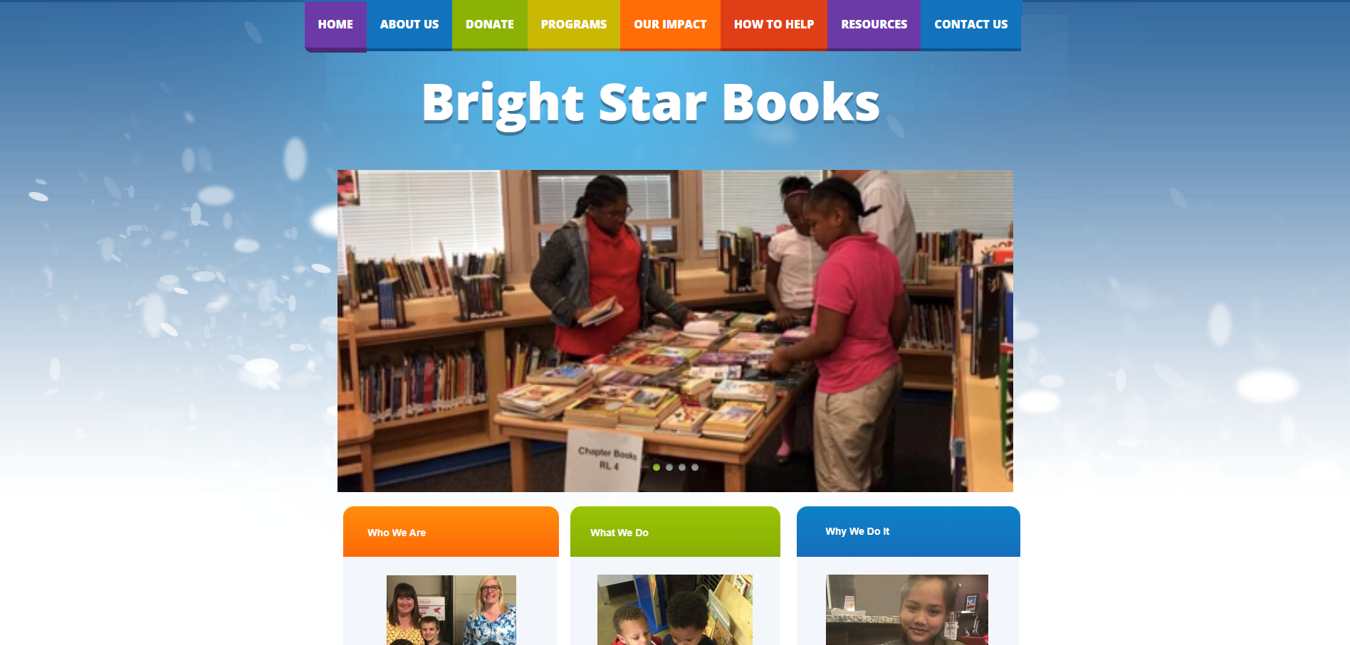
Original (Active) Site
By conducting a Heuristic evaluation we were able to determine issues with the site right off the bat:
Outdated
The site does not appear to be credible
Oversaturated navigation and lack of information hierarchy
Far too many colors
The site does not highlight key pages in its navigation
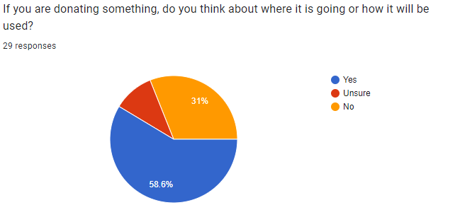
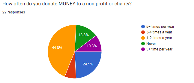
To understand more about our potential users, a survey was sent out to gauge user preferences about donating. 29 responses were recorded and insights about how, what, and when users donate to charitable organizations. Some of the findings include:
58.6% of participants consider where their items are going and how they will be used when they donate them
44.8% of participants donate MONEY 1-2 times per year
37.9% of participants donate ITEMS 3-4 times per year
Surveys

We wanted to understand our users and what situations may bring them to the site. In doing this, we developed the persona of Sarah below. We felt that she was an "all-encompassing user" and would utilize most of the changes made to the site.
Using survey data, we constructed the idea of Sarah
We wanted to focus on her goals and pain points
Sarah gave us a more defined direction to go and assisted us with effectively ideating features for the site
User Persona

Ideation
To effectively produce potential solutions for our users, my team and I began to ideate using an "I like, I wish, What if" matrix as well as a Feature Prioritization Matrix and User Flow for our selected task.
I like, I wish, What if Matrix
To brainstorm potential solutions for our users, we began to organize our ideas into an “I like, I wish, What if” Matrix.
Feature Prioritization
When considering prioritizing features, we used data synthesized from our surveys, personas, and "I like, I wish, What if" matrices to identify important features. We took these features and organized them based on importance and doability.
User Flow
Below, is a photo of our user flow constructed to outline the path a user would take to accomplish a task. In this case, the task was for the user to donate money.

Wireframing
To effectively enact our ideas for the features brainstormed above, we began to produce wireframes. However, before we could start wireframing, we needed to take inventory of the current site and organize it into a sitemap.

Site Map
Normally, Card Sorting would have come before this step to take inventory of the site's pages and content. However, the site only consisted of about 15 pages which made mapping easy.
We were able to consolidate the site map into only about 8 pages by combining similar pages and topics into one. We based this on the content's importance and decided to move some less relevant information to the footer menu to alleviate congestion.
Wireframe Prototype
Using Figma, we were able to move on to a low-fidelity wireframe design. We skipped pen and paper wireframes because we all worked better taking this straight into Figma.
A lot of my focus was on navigation, buttons, accordions, and other test components.
Additionally, I was responsible for the About Us, Volunteer, and Contact Us pages.
View prototype in full screen for the best results.
Testing
We created a fully functional wireframe prototype to test our users. We tested 5 users who were deemed suitable based on the fact that they had donated items at least once in the past year. Here are some of our findings:
Create an option to donate money and books from the same button.
Initially, we had combined the donate books and money screens on the same screen but decided to make them separate and make the "Donate" button a dropdown menu to direct the user to the respective pages.
Make all Pages Uniform
As there were three of us working on different pages, obviously our designs were different based on the page. However, we took this to heart and made making a consistent mock-up wireframe and style guide a priority.
These were our two main takeaways from testing. As our user flow, and goal was simple, our users were able to complete their tasks without much of a hiccup.
UI Design
Once we had completed testing, we felt we were in a good position to start thinking of the visuals of the site and fine-tuning interaction
We decided to keep the site bright and playful as it initially was to keep its character while making updates to every aspect of the look.
We tried to stick closely to material design when creating cards, buttons, and forms.
There were 3 prototypes designed. One for desktop, mobile, and tablet.
We believe that our new design solves all of the problems we set out to accomplish.
Style Tile
To the right is a style tile we had used to put some of our designs to paper and translate them into mock-up home pages as seen below.

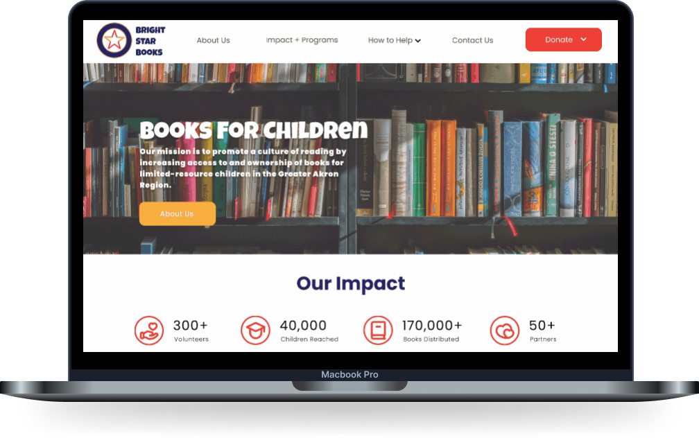
Mock-up Homepages
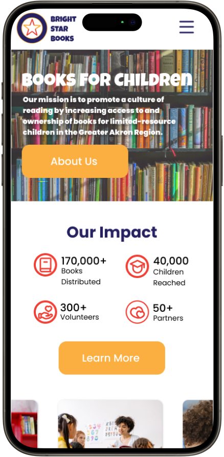
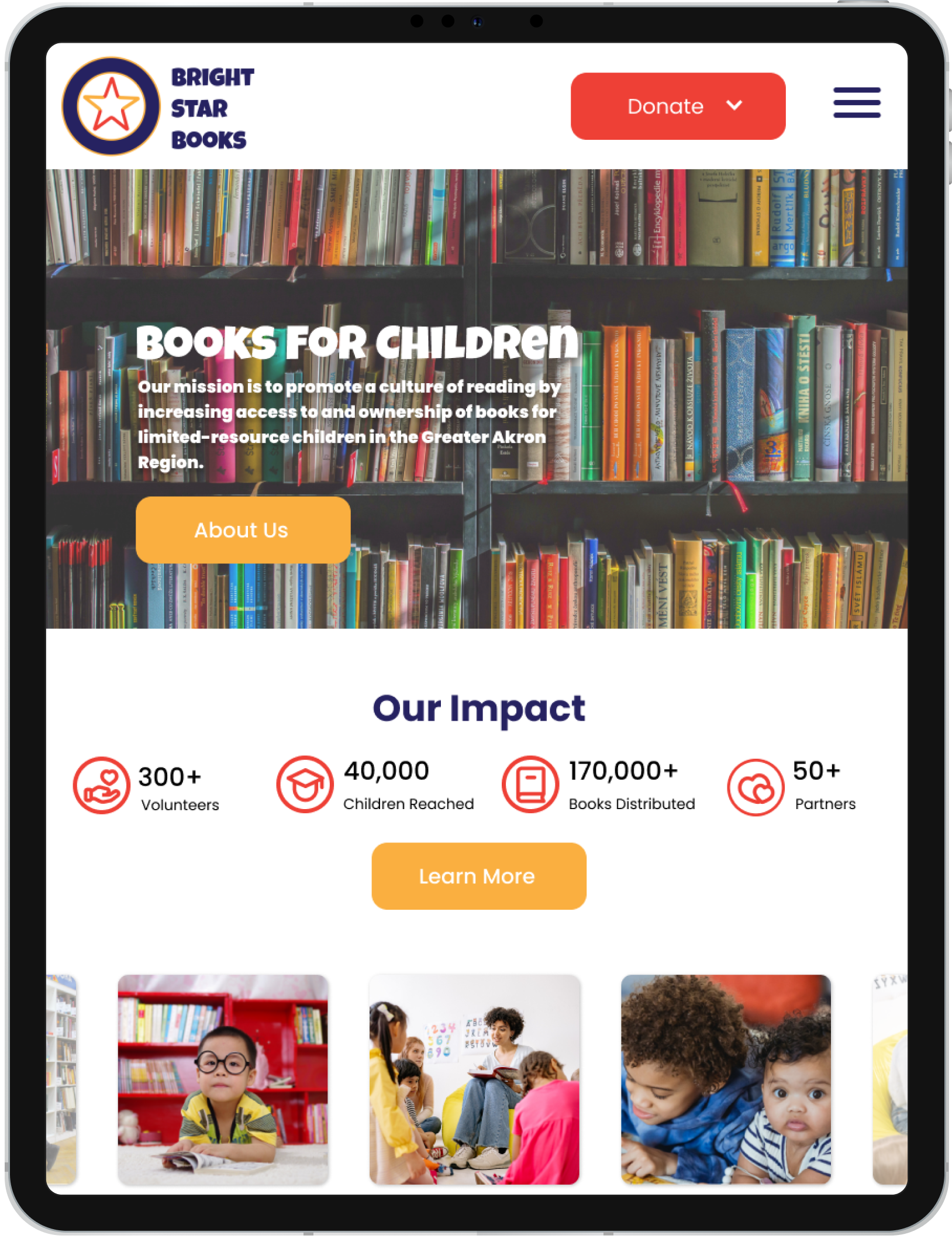
Once the mock-up was finished, it was ready to complete the style guide. I was hard at work creating functional components and navigation to include as well as page spacing and form style.
Style Guide
View style guide in full screen for the best results.
Results and Conclusion
Once everything was combined, we created a fully functional, high-fidelity prototype for the new and improved Bright Star Books website!
View prototype in full screen for the best results.
Next Steps
01
Do additional testing for further iteration and focus more development on the mobile view.
To complete the project, you will need to utilize your coding skills in HTML, CSS, and JavaScript to develop and then launch the website as the official online presence for Bright Star Books.
02
I feel that some additional attention should be focused on interactive components and making every bit of the prototype interactive.
03
Takeaways
This project, I felt was the first time that I felt completely confident in my ability to create components and use some of Figma's more tedious features. I was also able to effectively lead and delegate tasks to the team throughout the project. Although I did not want to be the leader going into the project, I assumed the role without question and took this project by the reigns which I hadn't done before. I was proud of and surprised by my ability to lead.
I also learned that not only is a website's end design important but also how you got there and what steps you took to deliver a result. What steps were taken? How can you justify the decisions you made?