Travel App Creation
Users struggle to find things to do and places to go while on trips. This includes: restaurants, bars, and activities.
Project Objective
An app that allows users to get recommendations of activities, restaurants, and bars to enjoy while on trips while conveniently allowing them to make reservations directly from the app.
Solution
Team
1 UX/UI Designer
Google Suite
Figma + Figjam
Miro
Tools
My Role
UX Researcher
UX Designer
Overall: 4 Weeks
Discovery & Research: 2 weeks
Design & testing: 2 weeks
Timeline
Process
Research
Definition & Ideation
Wireframing
Testing
Prototyping
Results & Conclusion
Research
To understand what and if there was a problem to be solved, I needed to begin by conducting research. I wanted to understand pain points experienced by users when making travel arrangements and what they need help with when travelers arrive at their destination.
To begin, I drafted and created a user interview plan to begin asking people who actively travel about their preferences. some sample questions include:
Can you walk me through your process when planning a trip?
What are some features you would like to see on a trip-planning app or site?
What do you find most difficult when traveling to new places?
User Interviews
“The planning process is not the most fun. I mean, planning can be stressful at times and, you know, everybody can have a difference of opinion of the whole planning process.”
“I want to see unique stays, restaurants, bars, experiences, because I think if you’re looking up like best stay or vintage motel stays in Columbus like you’re gonna get something really basic.”
A short survey was also sent out via social media, email, and text messages to a large number of people.
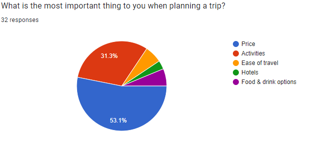
The survey received 32 responses from people mainly aged 18-35
2 most important things to travelers are:
Price (53.1%)
Activities (31.3%)
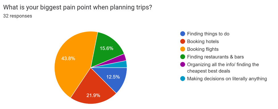
2 biggest pain points for travelers are:
Booking Flights (43.8%)
Finding things to do and finding restaurants & bars combined (28.1%)
Surveys
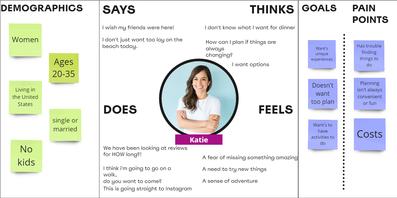
Once interviews were completed, I moved to organize my findings to empathize with the user and uncover their goals, pain points, and motivations. This work would help to create the user persona below to begin definition and ideation.
Empathy Map
User Persona
Problem Statement
We believe by providing users with unique and cost-conscious activities, bars, and restaurants, to adults aged 18-35, we will be able to provide them with unique experiences without breaking the bank and sticking within their level of comfort.
Definition & Ideation
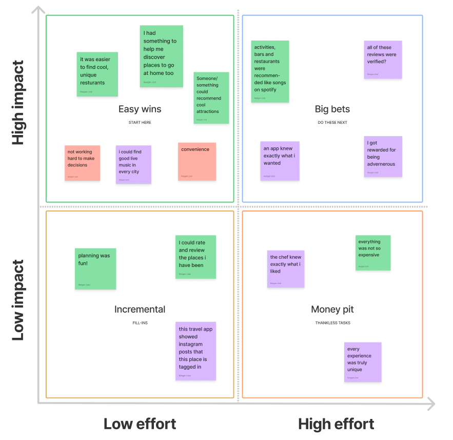
To effectively produce potential solutions for our users, we began to ideate using an "I like, I wish, What if" matrix as well as a Feature Prioritization Matrix and User Flow for our selected task.
When considering prioritizing features, we used data synthesised by our surveys, personas, and "I like, I wish, What if" matrices to identify important features. We took these features and organized them based on importance and doability.
Feature Prioritization
When considering prioritizing features, we used data synthesised by our surveys, personas, and "I like, I wish, What if" matrices to identify important features. We took these features and organized them based on importance and doability.
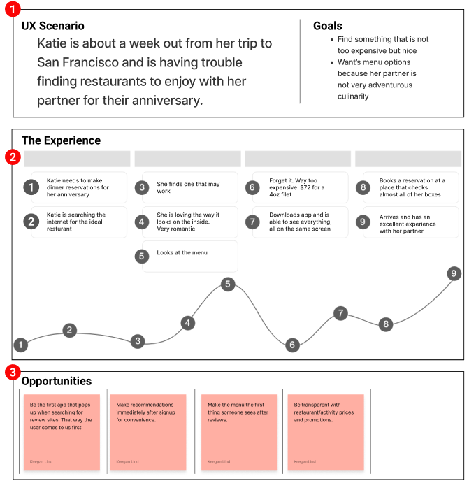
User Journey
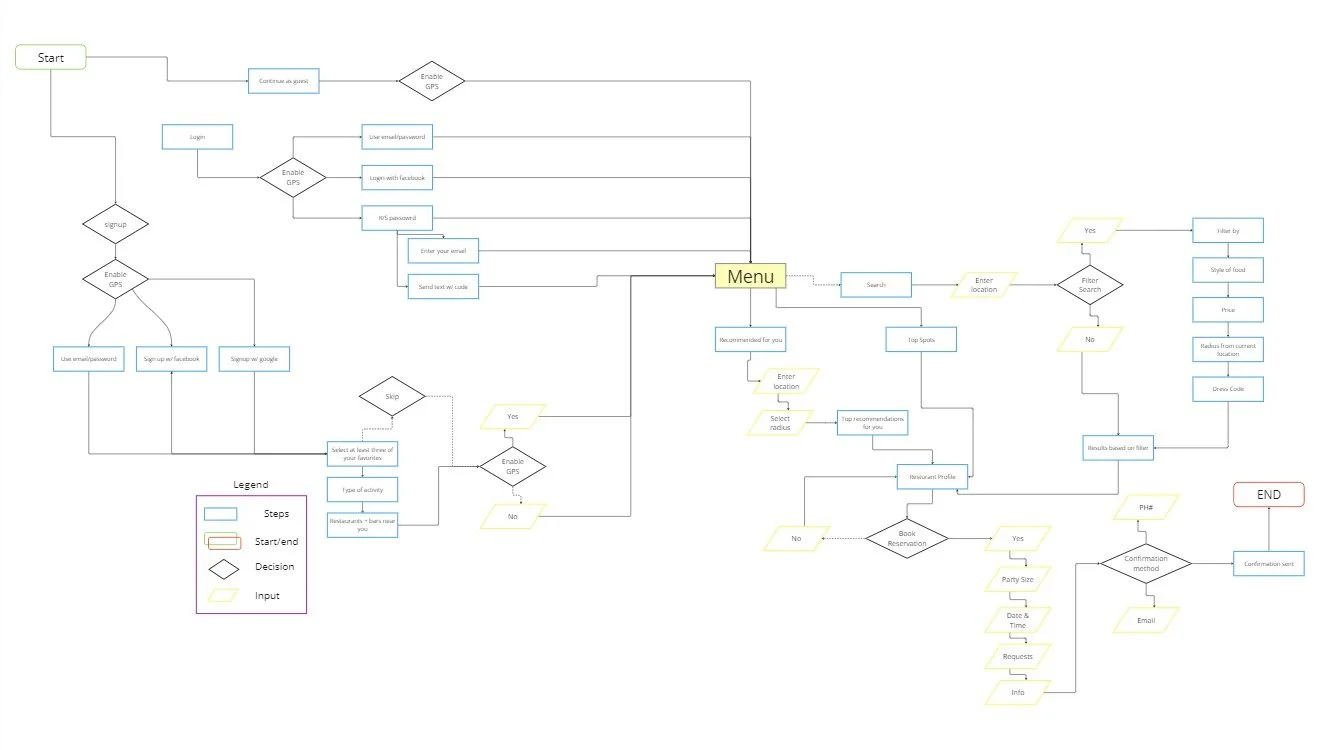
Below, is a photo of my initial user flow for the app. It covers onboarding as well as the task of the user making a reservation at a resturant.
User Flow
Wireframing
I began wire framing with sketches of what I wanted the app to look like based on my user flow. I then proceeded to convert these into low-fidelity wireframes. I then tested and iterated the designs into mid-fidelity wireframes.
Wireframe Sketches
Using Figma, I created digital wireframes and made them clickable to allow for testing to occur so that I could iterate and create mid-fidelity wireframes.
Wireframe Prototype
View prototype in full screen for the best results.
To synthesize results from testing, I created a test analysis chart to organize the data I gathered from my 5 test subjects.
User Test Analysis
Using the user testing data collected, I applied an iOS theme to the app and crated a mid-fidelity prototype seen to the left.
Mid-fidelity Prototype
View prototype in full screen for the best results.
Conclusion
Next Steps
Create a unique style for the app as opposed to using iOS components and making an Apple design.
01
Apply new strategies and methods learned over the past 6 months to create a unique experience for users.
02
Continue testing an iteration of the app and potentially explore other features aside from those in the user flow.
03
Takeaways
This was my first ever UX project and was a very big learning curve. I was able to apply my marketing experience and lean on it pretty heavily for the first portion of this project. However, learning how to use and operate Figma effectively was a challenge but a welcome one. I walked away learning a ton about how UX/UI designers operate and how other designers go about creating what they create. It was a humbling new perspective that you should never do anything just because “it looks nice” but because the research backs up your actions. I’m excited to return to this project once I have more experience and knowledge in UX/UI!


