
Energy.gov Website Redesign
Energy.gov is looking for a website redesign to limit user interface issues and increase site efficiency to help users find the information they are searching for.
Project Objective
Solution
Redesign navigation and website style to create a better experience for target users.
Team
1 UX/UI Designers
UI design
UX research
My Role
Overall: 4 Weeks
Discovery & Research: 1 week
Design & testing: 3 weeks
Timeline
Figma/Figjam
Google Suite
Miro
Tools
Process

Research & Analysis

Wireframing + Prototyping

Testing

UI Design

Results & Conclusion
Research & Analysis
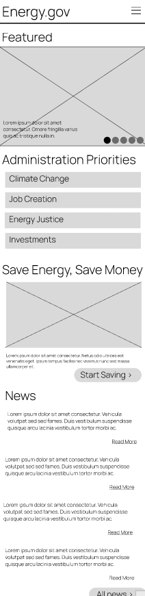
To begin addressing problems with the site, I began by looking at the current site. To start, I created a proto persona to lead testing and ideate what types of users would be coming to the site. I conducted a heuristic evaluation for the site visuals and conducted user tests for usability.
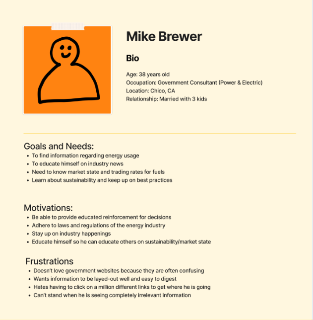
Proto persona
-
Ensure all pages are uniform, many of the pages on te site were straying from a committed style guide and were feeling out of place.
-
Make the site easier to digest, as it stands, the site is oversaturated with information. This could distract users from the information they are searching for.
-
There are many instances of irrelevant imagery across the site. Many of the articles have imagery that does not relate to the content and there are few icons used.
During the heuristic evaluation, I was able to gain useful insights as to how to improve the visuals of the site.
Heuristic Evaluation
User testing proved to be very insightful for issues to resolve on the site. Additionally, many of the users struggled to complete their tasks which was troubling since the site is so large and the tasks were so straightforward.
User Testing
“I wish there was not so much going on. I keep forgetting where I am on this site.”
“I think that the savings section should be simplified for what kind of person you are (e.g. Homeowner, renter, driver, etc.).”
“There are too many items in the navigation to sift through and I feel like the labels are not clear enough. ”
Wireframing & Prototyping
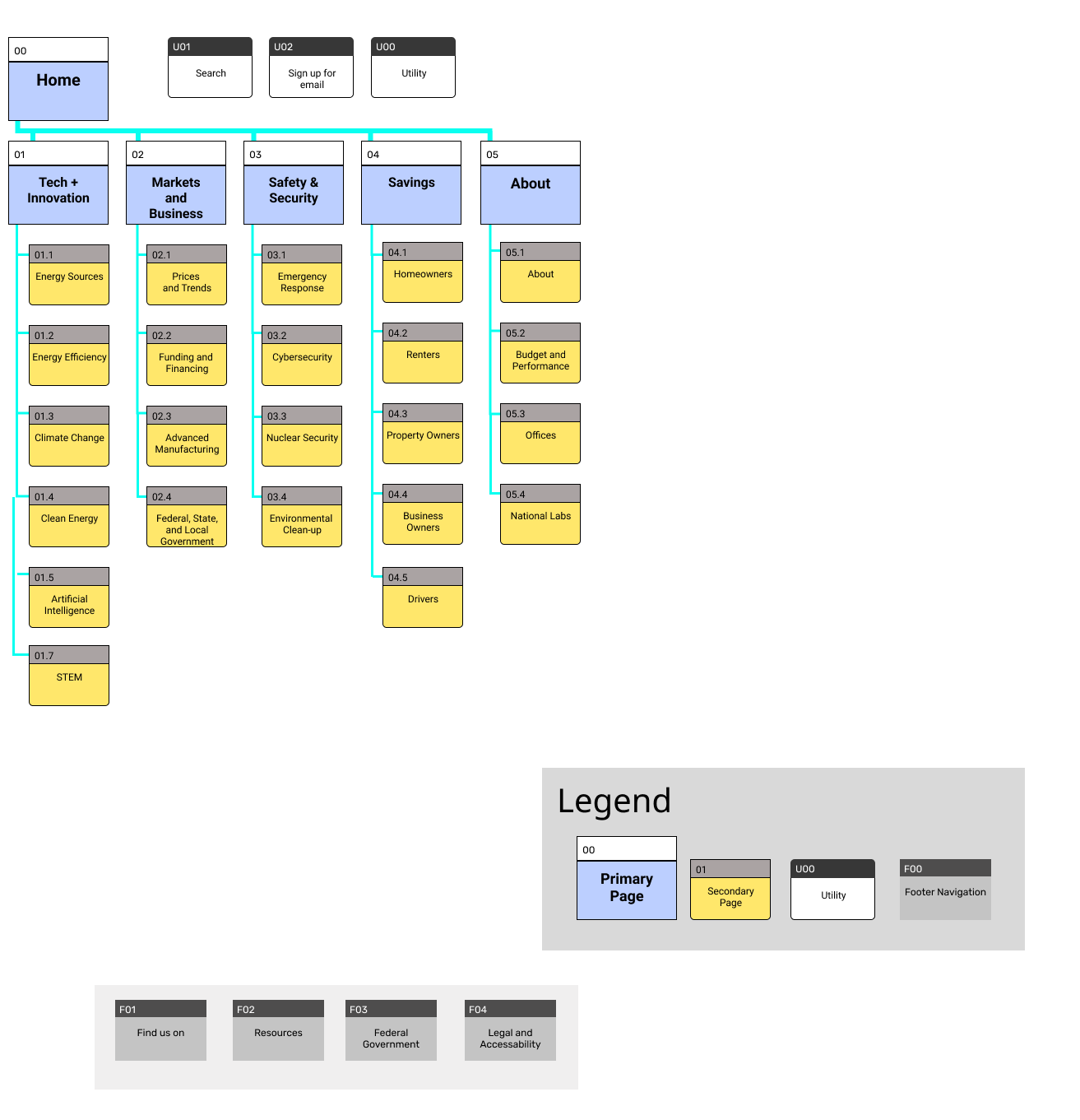
To effectively enact our ideas for the features brainstormed above, we began to produce wireframes. However, before we could start wireframing, we needed to take inventory of the current site and organize it into a sitemap.
To begin wireframing, I began with a site map to help me organize the site’s content and visualize what types of elements I should include in the site’s navigation.
Site Map
Navigation Prototypes
Once the site map was complete, I moved on to creating the site’s navigation. The creation of the components needed proved to be a challenge but was very fulfilling once I finally was able to get them to work!
Web
Mobile
5 second Test Findings
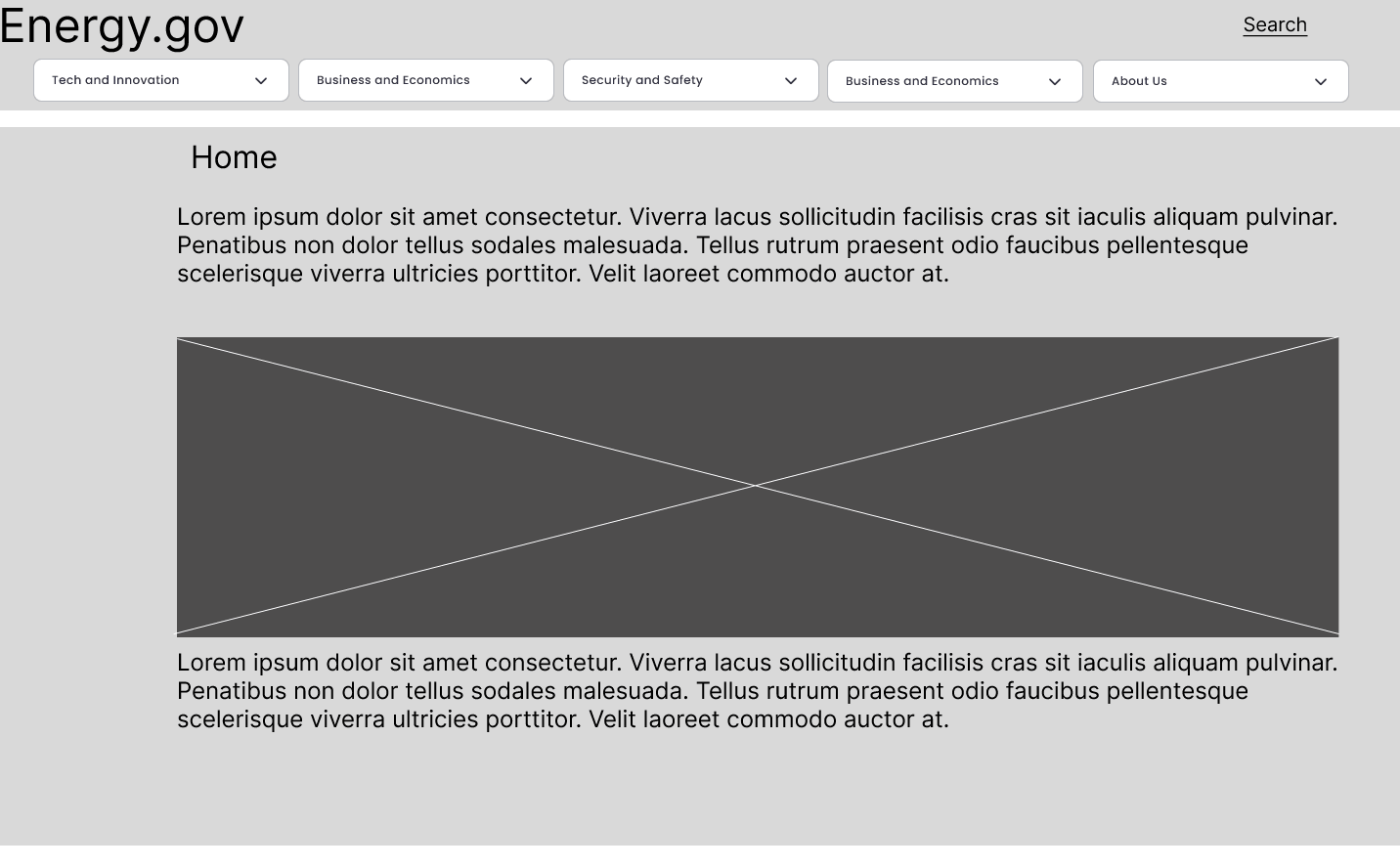
Once homepage wireframes were completed I conducted 5-second tests with users which revealed changes that needed to be made before continuing with mockups.
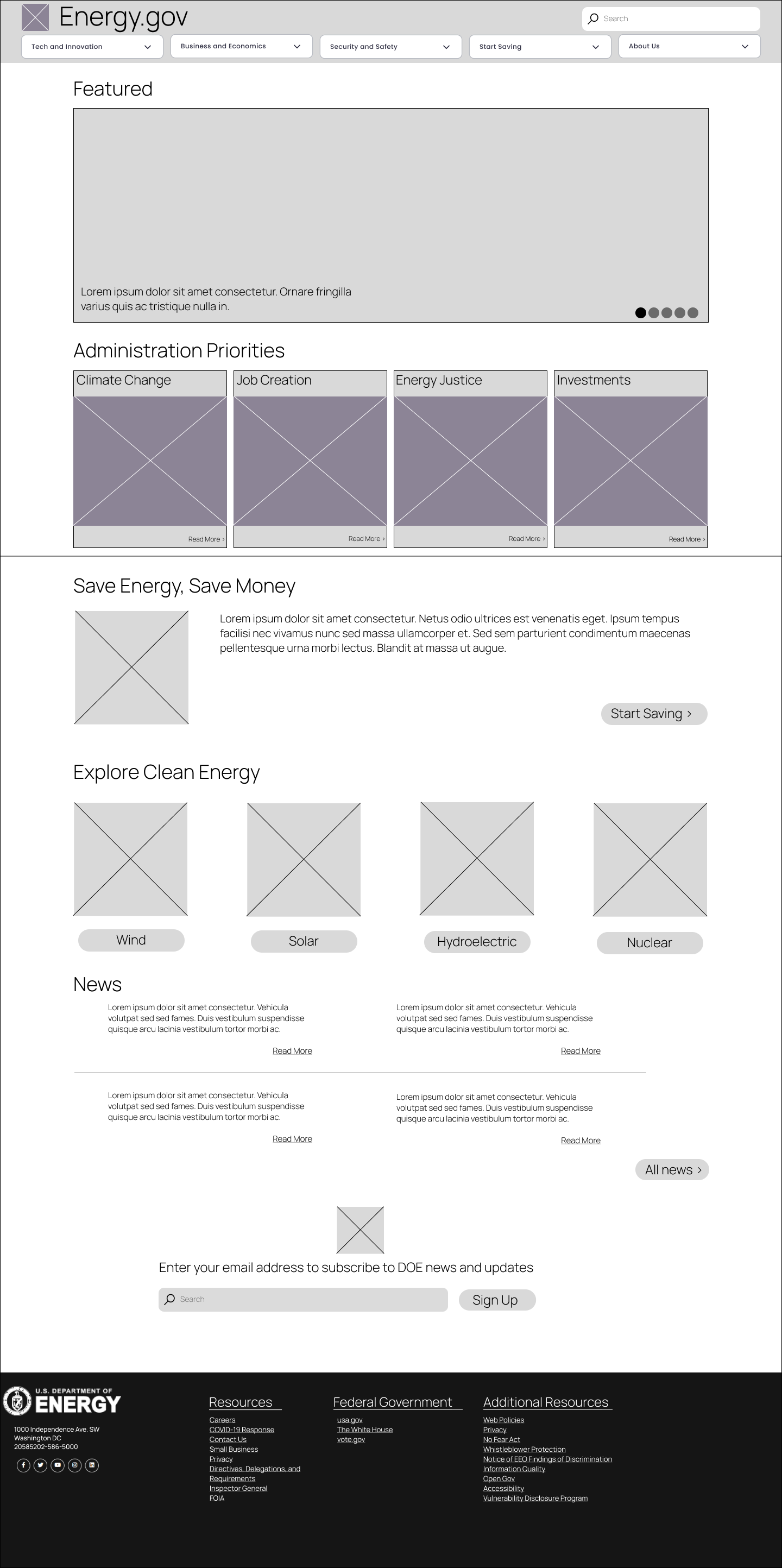
V.2 Wireframe
Once iterations were made based on the results of the 5-second tests, I had a clickable prototype that would serve as the baseline of my homepage mock-up which can be seen to the left.
UI Design
Once I felt that I was in a good position with wireframes and information architecture, I proceeded to begin designing the site’s UI and visuals. I wanted to modernize the site while keeping it informational and clean. However, I did not want to have the authoritative vibe that many other government sites have. The energy department is about progress and innovation and I felt that the site should embody that mission.
To begin planning visuals, I created a short-style tile to organize my typography, colors, images, icons, and basic navigational elements. I then applied this style guide to create homepage mock-ups for testing.
Style Tile

Homepage Mockups

Once the mock-up was finished, I was ready to complete the style guide. I committed the components I had created and visual outlines into a formal style guide for the site.
Style Guide
View style guide in full screen for the best results.
Testing
Once a clickable prototype was created, I began another round of user testing and found, to my surprise that a lot of the visual issues came down to spacing and alignment which were resolved for the final prototype.
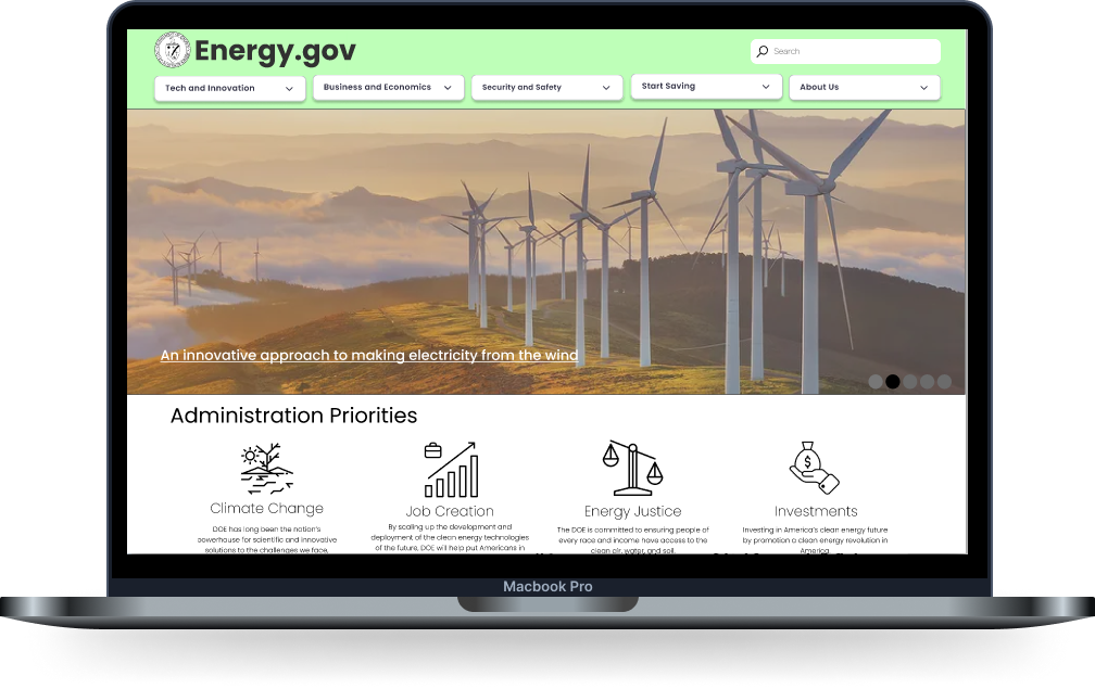
Users stated that they enjoyed the overall look of the site. They enjoyed that the website did not look “bureaucratic” and that it was fresh, new, sleek, and “not boring for a government site.”
Results and Conclusion
Once the changes were made based on user testing, I created a fully clickable and interactive prototype to showcase all of the research, planning, and testing that was put into the project.
View style guide in full screen for the best results.
Next Steps
Complete more user tests to further fine-tune the site and ensure that it is the most complete work that it can be.
01
Create a larger library of interactive components and a more “delightful” experience and I am still a novice at component creation.
02
Explore new options for typography and colors to make the site pop a bit more than it does. I feel like it is close but not perfect.
03
Takeaways
This project was a huge challenge for me. I hadn’t used Figma to this extent until this project and it pushed me to teach myself how to create my components and lean on the Figma community for help. I will say, I was shocked to see how complex Figma can be for being such a seemingly streamlined product. It was interesting to see the depths of the program.
This project showed me just how important understanding your user is and what their needs are. Before this, I had no idea of the type of person that would visit Energy.gov but having created a design based off of the proto persona I created, I feel like I have a better understanding of who they are and what they need. I hope to revisit this case study and apply more of the skills I learn along the way and make this website stand out even more.